

Good design.
Real materials.
Discover the stone, colour and detail that belong with your home.
Enter the material library ↗01 / A closer look
The material library.
Choose a manufacturer. Explore real product photographs and original colour samples. Save the combinations you want to see in person.
The photographic pattern studio currently supports Mega Melville in seven real material colours, with herringbone, running bond and one-third stagger layouts. Other products include original photos, colour samples and manufacturer laying guides. A curated starting collection of 8 product families and 38 photographed colour samples. Images are manufacturer references, not Milton Stone project claims. Product names and colours retain their official identities. Select Ontario where offered; confirm local supply, finish and format before ordering. Colour samples from printed catalogues can differ from current production.
02 / Find your direction
Architecture first.
Personality always.
Six ways to approach your outdoor space. These are our design directions, illustrated with real manufacturer material photography.
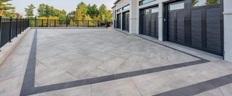
01 / Modern
A clear architectural rhythm.
Use generous formats, quiet joints and a restrained material family. Align the paving with the architecture, then introduce a small, deliberate contrast.
Photo: Unilock
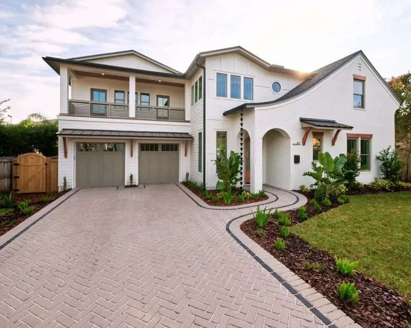
02 / Contemporary
Contrast with a purpose.
A smooth primary field can sit beside a textured accent. Repeat a colour or dimension so the contrast feels intentional.
Photo: Techo-Bloc
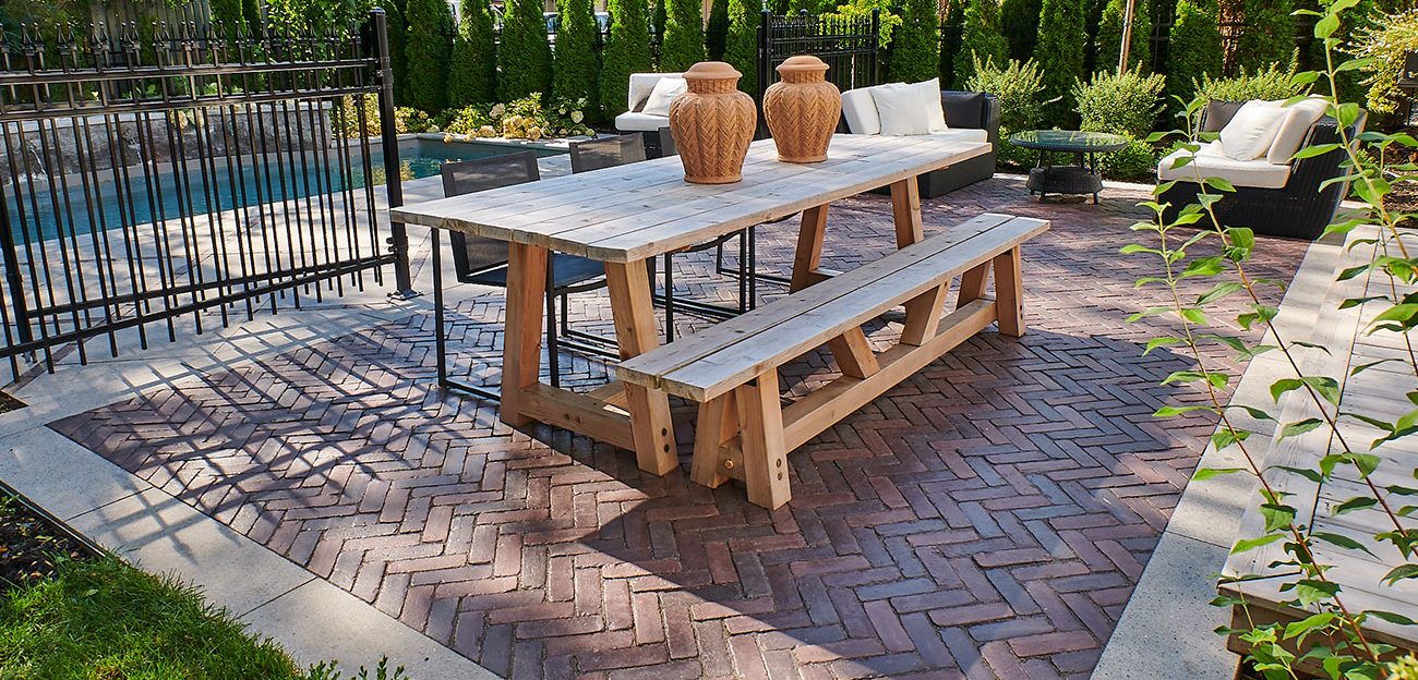
03 / Traditional
Texture, detail and familiar proportions.
Brick-like formats, layered planting and a carefully framed entrance can complement an established home. Let one border or inset carry the detail.
Photo: Unilock
04 / Scandinavian
Lightness and restraint.
Compare pale stone tones with natural wood and simple planting. A low-contrast field keeps the composition calm without flattening the material texture.
Photo: Permacon
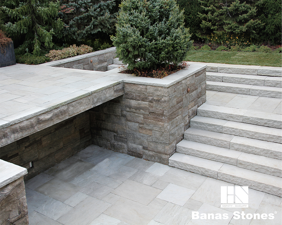
05 / Zen
Space to pause.
Natural stone, controlled transitions and open areas create a quieter composition. Use texture and shadow as carefully as colour.
Photo: Banas Stones

06 / Estate
A considered arrival.
Think in larger zones: the approach, the threshold and the garden. Repeat an accent across them, with a controlled change of scale.
Photo: Unilock
03 / The design conversation
Make every
material count.
Colour, texture, scale and contrast work together. Start with the architecture, then edit the choices until the whole property feels connected.
01Start with the house, not the swatch
Look at the brick, stone, roof, windows and front door together. Choose one dominant architectural tone to respond to. A sample that looks attractive alone can feel unrelated beside the facade.
02Find the undertone
Grey can read blue, green, brown or neutral; pale stone can feel warm or cool. Put large samples beside the house rather than comparing tiny screen chips. Look at the combination from the street and from inside.
03Build a colour hierarchy
Start with a main paving colour, a secondary material and one restrained accent. A 60/30/10 balance can be a useful visual starting point, not a measurement rule. Some properties are stronger with just two closely related tones.
04Mix textures with a purpose
Use one dominant finish, then introduce a contrasting texture where it helps define a feature: a rougher wall beside quieter paving, for example. Repeating several strongly textured surfaces can make a small space feel busy.
05Separate colour contrast from texture contrast
Two similar colours can still contrast through surface texture or unit size. Conversely, a strong charcoal border can provide definition without introducing another heavily textured material.
06Choose the right scale
Consider the dimensions of the space, the architecture and the furniture. Large formats can make a simple field feel calm; smaller units can articulate curves, borders or intricate patterns. Plan cuts and transitions before committing.
07Give each pattern a job
A primary field establishes the rhythm. A border frames it, and an inset can mark an entrance or change of use. If every zone has a different pattern, the eye has nowhere to rest. Repeat a material or line to connect spaces.
08Use direction deliberately
Test how the laying direction relates to the house, entrance and main sightline. Compare a straight and diagonal layout from the actual approach. A diamond or herringbone field needs a considered relationship to its boundary.
09Connect the front and backyard
The two spaces do not need identical layouts. Repeating an accent colour, stone family, coping detail or lighting finish can give the property continuity while allowing each area its own character.
10Bring planting into the palette
Treat planting as part of the composition. Leaf shape, seasonal colour and mature size can soften or reinforce the stonework. Leave enough room for planting to develop rather than treating it as a narrow leftover strip.
11Review daytime and evening character
A finish changes with shade, reflected light and artificial lighting. Review samples in more than one condition and consider the lighting colour alongside the stone. Avoid choosing a complete palette from a night photograph alone.
12Look at dry and wet samples
Water can deepen the apparent colour of paving and stone. Check physical samples dry and wet, and review the manufacturer’s finish and application information for the intended surface. Screen colours are only a starting point.
13Design around use and maintenance
Consider foot traffic, vehicles, poolside use, cleaning and winter maintenance when discussing materials. The right appearance still needs a suitable product, thickness, base, drainage and installation detail.
14Resolve levels before finishes
Doors, steps, drainage routes, walls and pool edges determine how the outdoor space fits together. A palette is easier to resolve once the plan and levels have a clear direction. Bring these questions to the design discussion.
15Test the combination at useful scale
Lay out enough samples to see repeated units, joints and colour variation together. Review border width against the full space. For natural stone and blended products, discuss the expected variation rather than relying on one sample.
16Know when to stop adding
Remove one competing material or detail and compare the result. A quiet field often gives craftsmanship, architecture and planting more presence. The most memorable feature needs room around it.
17Understand the border vocabulary
A soldier course turns the long dimension perpendicular to the edge. A double soldier course uses two rows. A sailor course places the long dimension parallel to the edge. These are border arrangements, not standalone product names. Check compatible sizes, thicknesses and edge restraint details.
18Brick, staggered and diamond layouts
Running bond is the familiar brick pattern. A one-third stagger changes the offset; it is not interchangeable with every product’s specified bond. A diamond layout turns a square grid 45 degrees and needs careful boundary cuts. Herringbone interlocks rectangular units at right angles.
19Choose colour combinations from real samples
For a cool direction, compare Unilock Beacon Hill Smooth in Granite Fusion with a Dark Charcoal accent. For a warmer discussion, compare its Fossil and Oat Beige samples. These are proposed pairings, not manufacturer-specified systems; verify thickness and availability.
20Keep natural flagstone distinct
Random flagstone uses irregular quarried pieces; modular paving uses planned rectangular and square sizes. A concrete product may reproduce a flagstone texture without being natural stone. Choose the material as well as the look.
Current collection notes / 2026
Explore what is new.
Choose what belongs.
Current catalogues offer a broad range of pale neutrals, nuanced greys, warm blends and textured brick formats. Compare actual samples here rather than relying on a trend label. Large formats, restrained borders and mixed textures are design directions to test against your own architecture.
Your personal shortlist
The material board.
Compare real samples side by side. Your selections stay in this browser; download the details to bring to a design conversation.
From a shortlist to a complete property
Let’s bring
the details together.
Bring your material board, photographs of your home and the way you want to use the space. We can develop the layout, transitions, planting and construction plan around them.
289 856 9735 ↗